Web Components 是一个浏览器原生支持的组件化方案,允许你创建新的自定义、可封装、可重用的HTML 标记。不用加载任何外部模块,直接就可以在浏览器中跑。本文就简单介绍一下:使用 Web Components 实现一个类 Element UI 中的 Card 卡片组件。
一、前言 随着前端工程化生态日益成熟,出现了很多优秀的框架,如:Vue、React、Angular等等,极大的提高了日常开发效率。Web Components ,相比与第三方框架使用起来更简单直接,符合直觉,不用加载任何外部模块,代码量小。
二、Web Components 核心组成 自定义元素(custom element),使用 window.customElements.define API注册 Shadow DOM隔离,影藏标记结构、样式和行为 可以在<template>中定义标记结构、样式,多次重用。利用 slot 插槽、命名插槽,可以传入定制化的结构UI,使用上类似 Vue 中的 slot 插槽 1. Custom Elements 自定义的 HTML 标签,称为自定义元素(custom element)。根据规范,自定义元素的名称必须包含连词线-,用与区别原生的 HTML 元素。所以,<com-card>不能写成<comcard>。
1 2 3 4 5 6 7 8 9 10 11 12 13 14 15 16 17 18 19 20 21 22 <div id ="custom-card" class ="com-card" > <div class ="com-card-head" > <slot name ="head" > </slot > </div > <div class ="com-card-body" > <slot > </slot > <div class ="link-wrap" > <a class ="link" href ="" title ="" > </a > </div > </div > </div > <script > class ComCard extends HTMLElement { constructor ( super () var tplEle = document .getElementById ('custom-card' ) this .append (tplEle) } } window .customElements .define ('com-card' , ComCard ) </script >
这样就注册了浏览器可识别渲染的一个自定义元素标签。
2. Shadow DOM Shadow DOM 是对DOM的一个封装。可以将标记结构、样式和行为隐藏起来,并与页面上的其他代码相隔离,保证不同的部分不会混在一起,可使代码更加干净、整洁。this.attachShadow() 方法可以开启 Shadow DOM。
1
2
3
4
5
6
7
8
9
class ComCard extends HTMLElement {constructor (super ()var shadow = this .attachShadow ({mode : 'closed' }) var tplEle = document .getElementById ('custom-card' )appendChild (tplEle)window .customElements .define ('com-card' , ComCard );
其中参数{ mode: 'closed' },表示 Shadow DOM 是封闭的,不允许外部访问。
3. templates 和 slots 因为组件的样式应该与代码封装在一起,只对自定义元素生效,不影响外部的全局样式。所以,可以把样式写在<template>里面,这样作为自定义元素结构的基础可以被多次重用。
1 2 3 4 5 6 7 8 9 10 11 12 13 14 15 16 17 18 19 20 21 22 23 24 25 26 <template id ="custom-card-template" > <style > </style > <div class ="com-card" > </div > </template > <script > class ComCard extends HTMLElement { constructor ( super (); var shadow = this .attachShadow ({mode : 'closed' }) var tplEle = document .getElementById ('custom-card-template' ) var content = tplEle.content .cloneNode (true ) shadow.appendChild (content) } } window .customElements .define ('com-card' , ComCard ); </script >
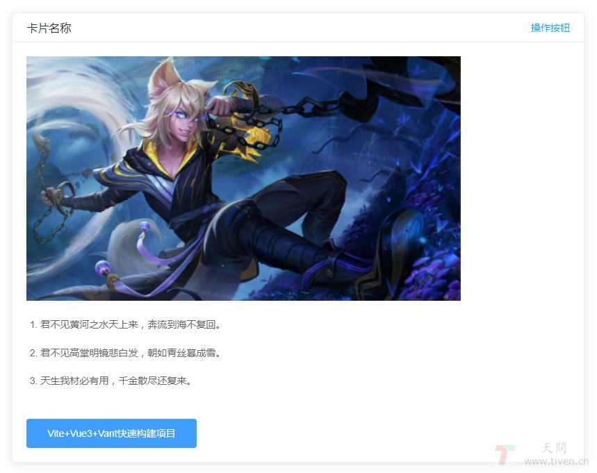
三、完整代码 1 2 3 4 5 6 7 8 9 10 11 12 13 14 15 16 17 18 19 20 21 22 23 24 25 26 27 28 29 30 31 32 33 34 35 36 37 38 39 40 41 42 43 44 45 46 47 48 49 50 51 52 53 54 55 56 57 58 59 60 61 62 63 64 65 66 67 68 69 70 71 72 73 74 75 76 77 78 79 80 81 82 83 84 85 86 87 88 89 90 91 92 93 94 95 96 97 98 99 100 101 102 103 104 105 106 107 108 109 110 111 112 113 114 115 116 117 118 119 120 121 122 123 124 125 126 127 128 129 130 131 132 133 134 135 136 137 138 139 140 141 142 143 144 145 146 147 148 149 150 151 152 153 154 155 156 157 158 159 160 161 162 163 164 165 166 167 168 169 170 171 172 173 174 175 176 177 178 179 180 181 182 183 184 185 186 187 188 189 190 191 192 193 194 195 196 197 198 199 200 201 202 <!DOCTYPE html > <html > <head > <meta charset ="UTF-8" > <title > Web Component</title > <style > * { box-sizing : border-box; } body { font-size : 14px ; } .box { padding : 5px 0 30px ; } .box .caption { display : none; } .box h1 { text-align : center; } .box li { color : #666 ; font-size : 14px ; line-height : 1.8 ; margin-top : 15px ; } .img { display : block; width : 80% ; margin : 0 !important ; } .card-head { display : flex; justify-content : space-between; align-items : center; } .card-title { color : #333 ; font-size : 16px ; } .card-head-btn { color : #409eff ; cursor : pointer; text-decoration : none !important ; } .card-head-btn :hover { text-decoration : none; } </style > </head > <body > <div class ="box" > <h1 > Web Component</h1 > <com-card data-show-head ="0" data-url ="https://tiven.cn" data-title ="天问博客" > <div slot ="head" class ="card-head" > <div class ="card-title" > 卡片名称</div > <a class ="card-head-btn" > 操作按钮</a > </div > <img class ="img" src ="https://tiven.cn/static/img/kpl-sunwukong-a3Lt-ed2NG9r4NFDm_9DA.jpg" alt ="天問" > </com-card > <br > <br > <com-card data-show-head ="1" data-url ="https://tiven.cn/p/de241e23/" data-title ="Vite+Vue3+Vant快速构建项目" > <div slot ="head" class ="card-head" > <div class ="card-title" > 卡片名称</div > <a class ="card-head-btn" onclick ="hello()" > 操作按钮</a > </div > <img class ="img" src ="https://tiven.cn/static/img/kpl-xuance-JqX71qH7aTflHV_gqvhIc.jpg" alt ="天問" > <ol > <li > 君不见黄河之水天上来,奔流到海不复回。</li > <li > 君不见高堂明镜悲白发,朝如青丝暮成雪。</li > <li > 天生我材必有用,千金散尽还复来。</li > </ol > </com-card > </div > <template id ="custom-card-template" > <style > .com-card { min-width : 200px ; min-height : 100px ; border-radius : 4px ; border : 1px solid #ebeef5 ; background-color : #fff ; overflow : hidden; color : #303133 ; transition : .3s ; box-shadow : 0 2px 12px 0 rgba (0 , 0 , 0 , 0.1 ); } .com-card-head { padding : 10px 20px ; border-bottom : 1px solid #ebeef5 ; box-sizing : border-box; } .com-card-body { padding : 20px ; } .link-wrap { text-align : left; padding-top : 20px ; } .link { display : inline-block; height : 42px ; line-height : 43px ; padding : 0 30px ; text-align : center; cursor : pointer; color : #fff ; background-color : #409eff ; border-color : #409eff ; -webkit-appearance: none; box-sizing : border-box; outline : none; transition : .1s ; font-weight : 500 ; -moz-user-select: none; -webkit-user-select: none; -ms-user-select: none; font-size : 14px ; border-radius : 4px ; text-decoration : none !important ; } </style > <div class ="com-card" > <div class ="com-card-head" > <slot name ="head" > </slot > </div > <div class ="com-card-body" > <slot > </slot > <div class ="link-wrap" > <a class ="link" href ="" title ="" > </a > </div > </div > </div > </template > <script > class ComCard extends HTMLElement { constructor ( super (); var shadow = this .attachShadow ({mode : 'closed' }) var tplEle = document .getElementById ('custom-card-template' ) var content = tplEle.content .cloneNode (true ) var attrList = Array .from (this .attributes ); var props = attrList.reduce ((prev, item )=> { prev[item.name ] = item.value return prev }, {}) if (props['data-show-head' ]!=='1' ) { var head = content.querySelector ('.com-card-head' ) head.remove () } var urlEle = content.querySelector ('.link' ) if (props['data-url' ] && props['data-title' ]) { urlEle.href = props['data-url' ] urlEle.title = props['data-title' ] urlEle.innerText = props['data-title' ] } else { urlEle.remove () } shadow.appendChild (content) } connectedCallback ( console .log ('connectedCallback' ) } disconnectedCallback ( console .log ('disconnectedCallback' ) } adoptedCallback ( console .log ('adoptedCallback' ) } attributeChangedCallback ( console .log ('attributeChangedCallback' ) } } window .customElements .define ('com-card' , ComCard ); function hello ( alert ('Hello,Web Component' ) } </script > </body > </html >
最终效果如上图所示,具体demo演示地址:https://tiven.cn/demo/web-component.html
四、Web Components vs Vue Components Vue Component Web Component data 实例属性 props attributes watch observedAttributes、attributeChangedCallback computed getters methods class methods mounted connectedCallback destroyed disconnectedCallback style scoped template中的style template template
五、Web Components 生命周期回调函数 connectedCallback:当 custom element首次被插入文档DOM时,被调用。disconnectedCallback:当 custom element从文档DOM中删除时,被调用。adoptedCallback:当 custom element被移动到新的文档时,被调用。attributeChangedCallback: 当 custom element增加、删除、修改自身属性时,被调用。六、优点 and 缺点 优点:
浏览器原生支持,不需要引入额外的第三方库 语义化 复用性,移植性高 不同团队不同项目可以共用组件 缺点:
需要操作DOM 目前浏览器兼容性、性能方面不够友好 和外部css交互比较难 七、基于web components的框架 LitElement 是一个快速、轻量级的 Web UI 框架。使用 lit-html 来渲染元素。Polymer 是一款实用、基于事件驱动、封装性和交互性强的 Web UI 框架。Omi 是基于 Web 组件的跨框架跨平台框架 。移动端 & 桌面 & 小程序。Direflow 以 React 方式写 Web Components。欢迎访问:天问博客
'%3E%3Cpath fill-rule='evenodd' clip-rule='evenodd' d='M33.232 28.434a2.5 2.5 0 001.768.733 1.667 1.667 0 010 3.333H5a1.667 1.667 0 110-3.333 2.5 2.5 0 002.5-2.5v-8.104A13.262 13.262 0 0118.333 5.122V1.667a1.666 1.666 0 113.334 0v3.455A13.262 13.262 0 0132.5 18.563v8.104a2.5 2.5 0 00.732 1.767zM16.273 35h7.454a.413.413 0 01.413.37 4.167 4.167 0 11-8.28 0 .417.417 0 01.413-.37z' fill='%23BDC4CB'/%3E%3C/g%3E%3Cdefs%3E%3CclipPath id='clip0'%3E%3Cpath fill='%23fff' d='M0 0h40v40H0z'/%3E%3C/clipPath%3E%3C/defs%3E%3C/svg%3E)